When was the last time that you evaluated your school’s website from a user’s perspective?
Designing, expanding or managing a university or community college website can be a challenge for many institutions. College websites tend to have a tremendous amount of content geared toward several target audiences, each with diverse needs and unique pain points.
As such, it’s easy to fail at presenting information in a thoughtful, effective and visitor-friendly format.
Mambo Media’s experience in designing and developing higher education websites has taught us that there are five essential components that every school’s site should have. Take a look and see how well your site addresses each of these items. If your site is falling short in one or several of these areas, contact Mambo to find out how we can help.
1. Thoughtful, Simple Navigation
It is essential that colleges provide website visitors with a straightforward and intuitive way to navigate a site and find the content they are looking for. Addressing multiple audiences’ unique pain points and content needs can be a challenge for many institutions. For example:
- Current Students may need know how to setup their portal account to access their class information
- Prospective Students may want information on student housing or scholarships
- Parents may want to learn more about campus safety
To address all of these needs, college websites need a clearly defined navigation structure so that key audiences can quickly gain access to the information that is most important to them.
Let’s take a moment to explore a few of the most common ways a college can structure their navigation:
- Audience segmentation
- Main topic organization
- Hybrid approach
Navigation by Audience Segmentation:
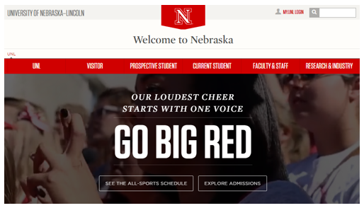
Organizing your content and website navigation around segmented audience groups will make it easy for visitors to find key content that speaks to their pain points. In the example below, University of Nebraska-Lincoln displays clearly identifiable paths like, “Current Student” verses “Faculty and Staff”, in the main navigation of a homepage and makes it easy for visitors to self-select and quickly find what they are looking for.
Navigation by Main Topic:
Another option for universities to categorize their main navigation is by grouping key content by topic. In the example below from Stanford University, visitors looking for program information or class schedules can select options from the “Academic” menu. Users looking for the cost of attending the university can select “Tuition and Fees” from the “Admission” menu. Using clear content pathways and keywords in the navigation guides users to the information that they are looking for in a easy-to-understand way.
Navigation Using a Hybrid Approach:
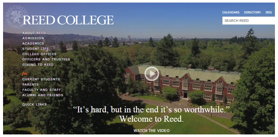
Some institutions want the best of both worlds and choose a navigation structure that combines audience segmentation and key content. Depending on how this information is presented, this can be a great solution. However, beware! Sometimes including both options can result in a lengthy and complex navigation presentation. Be strategic and thoughtful in the presentation of a hybrid approach so the menu structure doesn’t overwhelm users with too many options.
Oregon’s own Reed College is a great example of a clear and effective hybrid approach to website navigation.

Back to the five elements every college website should have…
2. Robust Search Functionality
Often users visit a website to find information on a very specific topic. Website visitors expect to see a search box to assist them in finding content quickly. Universities need to have robust search functionality so that users can swiftly and easily access the content that they are looking for. Keep in mind that visitors expect certain key elements of a site—like a search bar or portal login— to be located in the same general area. Be sure to place your search bar strategically, and be consistent in this placement across all website pages.
3. Mobile Responsiveness
Today’s university websites must be mobile responsive! Parents, faculty and students alike increasingly rely on their smartphones and tablets to access content on the web. If your college campus – like most – serves Millennial students in the 18-34 year old range don’t delay in ensuring that your site is mobile responsive today!
When verifying the responsiveness of a college website make sure that the menu navigation is presented in a clear format for mobile. Often, elaborate drop down menus do not display clearly via mobile devices and provide a poor user experience to mobile visitors. Identify the components of your site that don’t translate well on mobile devices and make sure you are still providing users with information they need. (Mambo can help sort this out with you.)
4. Include Calls to Action (CTAs)
Lead your visitors to engage with you. Are you using buttons and/or hyperlinks to drive your audience to take action? Have you identified what your calls to actions (CTAs) are and what you want your user to do on your pages? Do you want them to schedule a campus visit, request more information or find out more about your programs?
Once you identify what your CTA should say, you need to make sure it stands out on the page. Using contrasting colors and brief text helps attract a visitor’s attention. Be sure to lead with specific CTAs throughout your website.

Example: Arizona State University
5. Prioritize the Most Important Content
Take the time to organize your content so that the most important information can be found quickly. First, identify what content is the most important to your visitors. (You can use Google Analytics to figure out where most of your visitors go on your site. That’s generally a great first step.) Next, make sure your content answers visitors’ key questions, and be sure that information is prioritized accordingly.
Key content, such as information about Financial Aid, should be presented at the top of a drop down menu for example. Don’t make a user scroll to find priority content. When researching your audience’s questions and pain points, be sure to order your content to reflect their priorities.
Updated: Bonus Tip! Accessibility
Now that you have incorporated the key elements to include in a college website, you will want to ensure that your audience can easily view the content. Using WAVE, a web accessibility evaluation tool you can run a report to identify areas of your website that need improvement to provide better accessibility to your users.
Some common accessibility issues:
- Contrast-related issues – those that result in your website content being difficult for a reader with vision issues to read due to lack of contrast between font color and background colors.
- Inconsistent use of headings – those issues that arise from either not using proper Heading tags or by going from an H1 tag to an H4 tag instead of in sequential order. To clearly identify headings, be sure heading tags are used verse standard formatting techniques like font size, bold or italics.
As more digital natives – here comes Generation Z! – attend colleges and universities, it’s more important than ever to ensure your website is updated to meet the demands of today’s students.
Not sure if your college or university website is up to modern standards? Or how to get from what you have today to what you need? Get in touch with Mambo, we’d be happy to offer a quick evaluation of your website.


Sorry, the comment form is closed at this time.